Mastering the Art of Photographing Books: Capturing Light, Texture, and Narrative
So, you want to take pictures of books that really pop, huh? It’s not just about pointing your camera and clicking. You gotta think about the light, how things look, and what story the book is trying to tell. We're going to break down how to make your book photos look amazing, turning simple shots into something special. It’s all about capturing the vibe, the feel, and the soul of the book.
Key Takeaways
- Natural light is your best friend for book photos. Try to use window light and avoid harsh midday sun. Soft, indirect light shows off textures and colors best.
- Think about where you place your camera. Shooting from above is good for neat layouts, while side angles show off the book's texture and depth. Angles change how the story feels.
- Pay attention to the book itself. Open pages, the paper's grain, and even how pages move can add a lot to your photo. These details make the book feel real.
- Props and settings matter. Choose things that fit the book's style without stealing the show. Think about the book's genre and the mood you want to create.
- Editing should make the photo better, not fake. Straighten lines, fix colors, and make sure the details are clear. But don't go overboard; let the book shine through.
Harnessing Light for Compelling Book Photography
Light is pretty much everything in photography, and when you're shooting books, how you use it can totally change the final picture. A lot of people starting out don't realize just how much lighting impacts their shots. If you want to show off a book's story, its design, or just the vibe it gives off, you've got to get a handle on using light to make it look its best.
Understanding Natural Light's Advantage
Natural light is usually the most forgiving and flattering choice for photographing books. It has this soft, spread-out quality that artificial lights often struggle to match. Daylight keeps colors true and shows off textures without making things look weird. Artificial lights, like lamps or overhead bulbs, can create annoying glare, weird color casts, and harsh shadows that just don't do your book any favors. The goal is to make the book look its best, not to show off your lighting setup.
Navigating Midday Light and Window Placement
Midday sun can be pretty intense. It's bright, sure, but it's also direct and can create really strong contrasts. This might hide the subtle details on a book's cover or pages. If you have to shoot during the middle of the day, try to soften that light. A sheer curtain or even a thin piece of fabric can help cut down on those harsh spots and reflections. Where your window is matters too. North-facing windows often give you a steady, indirect light all day, which is great. South-facing windows give you strong light, but you'll need to manage it carefully. East and west windows are best in the morning and late afternoon, respectively.
Here's a quick look at window directions and their typical light:
| Window Direction | Light Quality |
|---|---|
| North | Consistent, soft, indirect |
| South | Bright, direct (needs diffusion) |
| East | Morning light (warmer, softer) |
| West | Afternoon light (can get warmer, harsher) |
Strategic Use of Shadows and Highlights
Most photographers try to get rid of shadows, but they can actually be your friend when photographing books. Shadows add depth and can help tell a story. An open book with some pages falling into shadow can feel really inviting. The trick is to use them without hiding important details. Try angling the book so light hits one part of the page while another part is in shadow. This mix of light and dark makes the photo more interesting. You can control how dark the shadows are by moving the book closer to or further from the light source. Highlights are good too, but use them carefully. A little bit of light catching the edge of a page or the texture of a cover can be nice, but if the light is too strong, it just washes out the detail and distracts the viewer.
Sometimes, the simplest approach is the most effective. Instead of fighting the light, learn to work with it. Observe how it falls, how it changes throughout the day, and how different angles affect the look of the book. Patience is key; rushing a shot often leads to less-than-ideal results.
Shooting during the 'golden hour'—that time shortly after sunrise or before sunset—can give your photos a warm, atmospheric glow. The light is softer then, creating gentle shadows that add a lot of mood. It’s a great time to capture those cozy reading vibes.
Crafting Composition and Narrative Through Angles
So, you've got the light sorted, but how do you actually arrange things to tell a story? That's where angles and composition come in. It's not just about pointing your camera and clicking; it's about guiding the viewer's eye and making them feel something.
The Impact of Camera Angles on Storytelling
Think about how you look at things in real life. You don't always see them straight on, right? Your camera can do the same. Changing your viewpoint can completely shift the mood and message of your photo. A shot from way up high, looking down, feels different than one from down low, looking up. It's like telling the story from a different character's perspective.
Achieving Symmetry with Flat Lays and Straight-On Shots
Sometimes, you want things to feel neat and orderly. That's where flat lays and straight-on shots shine. A flat lay, where you shoot directly down onto your arrangement, is great for showing off a book surrounded by other items. Think a cozy mug, some reading glasses, maybe a few fallen leaves if it's autumn. It's all about balance and making everything look intentional.
- Flat Lays: Perfect for showcasing multiple items around a central book. Aim for a clean, organized look.
- Straight-On Shots: Best for highlighting book covers or spines on a shelf. Use a tripod to keep it perfectly level.
- Symmetry: This style works best when everything is aligned and balanced. It gives a sense of calm and order.
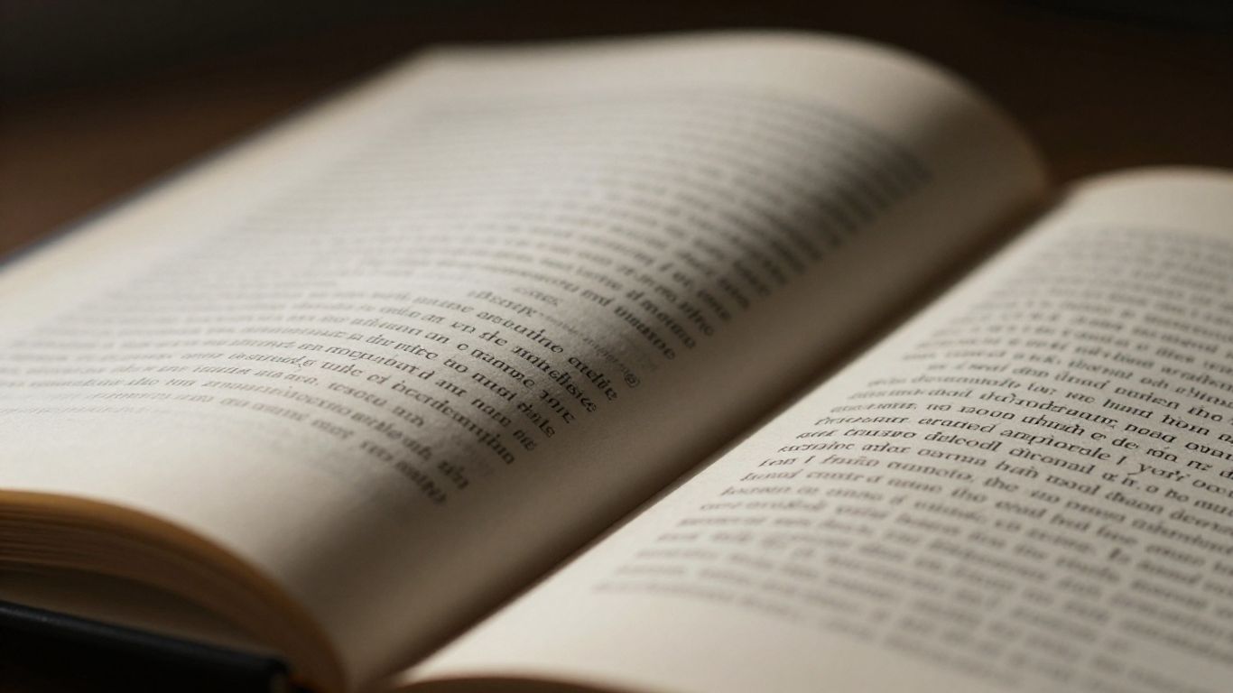
Utilizing Side Angles for Depth and Texture
Want to show off the worn edges of a book or the texture of its pages? You'll want to use side angles. Shooting from the side, maybe a little above or below eye level, adds a sense of depth. It makes the book feel more real, more touchable. You can really see the grain of the paper or the details on the spine this way. This is where you can really make the physical object of the book come alive.
When you're composing your shot, think about the journey the viewer's eye will take. Are you leading them directly to the book, or are you letting them wander through the scene first? Negative space, the empty areas in your photo, can be just as important as the objects themselves. It gives your subject room to breathe and helps it stand out.
Elevating Visuals with Texture and Detail
Okay, so we've talked about light and angles, but what about the actual feel of the book? That's where texture and detail come in. It's not just about showing a book; it's about making someone want to touch it.
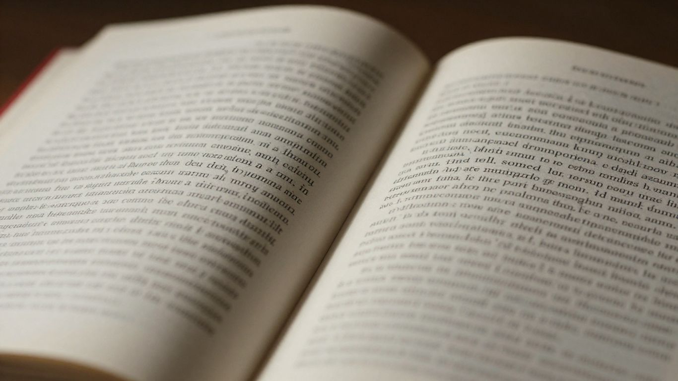
Capturing the Nuances of Open Book Shots
When you open a book, you're inviting the viewer in. It's more than just showing text or pictures. Think about the way the pages curve, the slight crease in the spine, or even the subtle grain of the paper itself. These small details tell a story about the book's life and how it's been used. A well-loved book might have slightly dog-eared pages, while a brand new one will have crisp, sharp edges. Try shooting an open book from a slightly elevated angle, letting the light catch the edges of the pages. This can create a really nice sense of depth and highlight the paper's texture.
Enhancing Texture Through Lighting and Angles
Lighting is your best friend when it comes to texture. Side lighting is fantastic for this. If you position your light source to the side of the book, it will create little shadows in the nooks and crannies – think about the raised lettering on a cover or the weave of a cloth-bound spine. This makes those textures pop. Angles matter too. A straight-on shot might flatten everything out, but tilting your camera just a bit can catch those textures in a more interesting way. It’s all about playing with light and shadow to make the surface details visible.
Here's a quick rundown of how different lighting can affect texture:
| Lighting Type | Effect on Texture |
|---|---|
| Front Lighting | Minimizes texture, makes surfaces appear flatter. |
| Side Lighting | Creates shadows that define and emphasize texture. |
| Backlighting | Can create a halo effect, highlighting edges and thin textures. |
| Top Lighting | Can create harsh shadows, good for dramatic texture definition. |
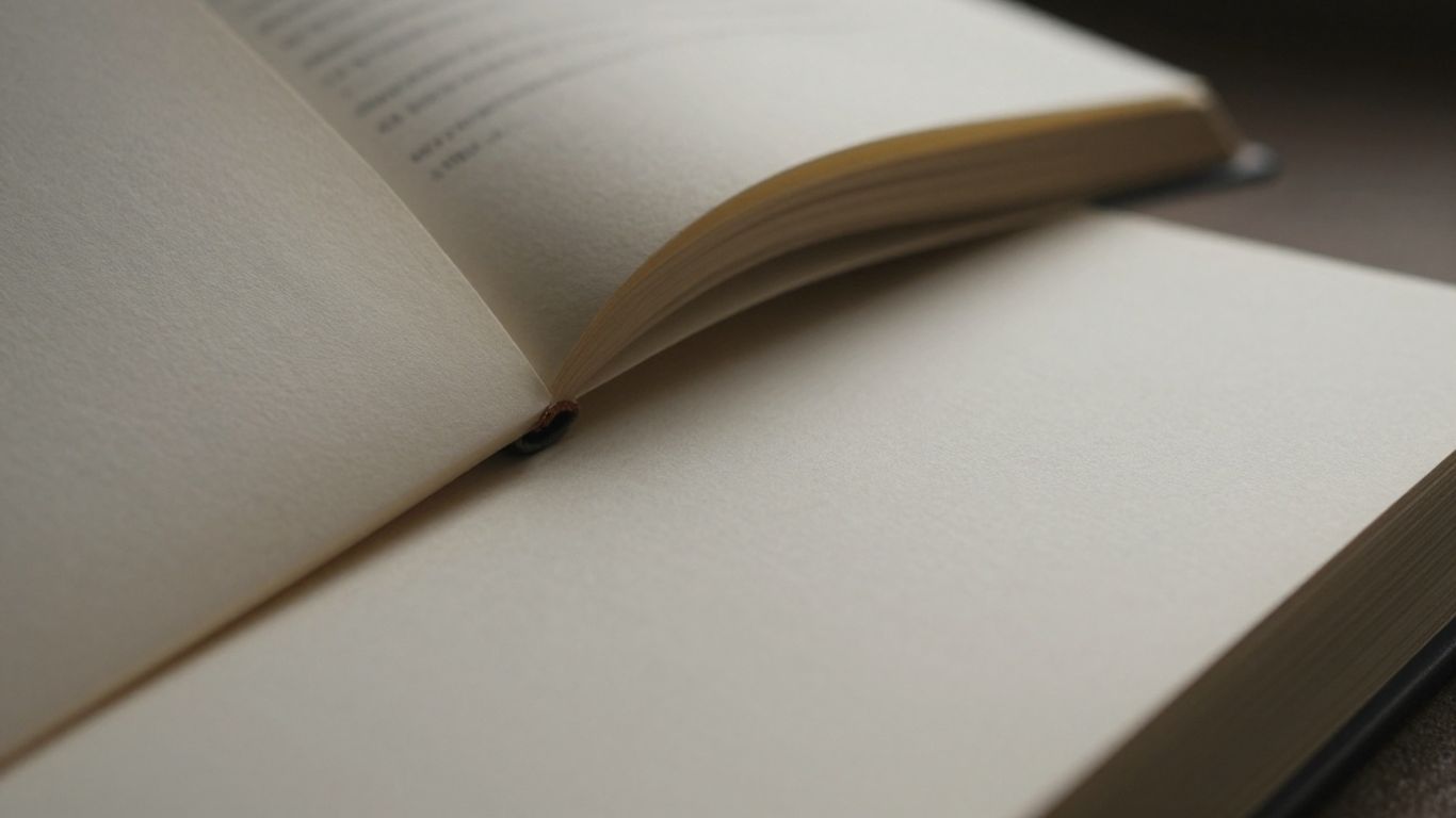
The Role of Page Movement and Paper Grain
Don't be afraid to show the book in action, or at least hint at it. A slightly ruffled page, or even a few pages fanned out, can add a dynamic feel. This suggests someone was just reading it, or is about to. And the paper grain? It's subtle, but it's there. Sometimes, a close-up shot focusing on the paper itself, maybe with a bit of light grazing across it, can really show off its quality and character. It adds a tactile element that’s hard to ignore.
Sometimes, the most compelling details aren't the obvious ones. It's the slight wear on a spine, the faint imprint of a previous reader's finger, or the way the paper feels under the light. These are the things that give a book its personality and make a photograph feel real.
Styling and Prop Selection for Context
So, you've got your book, you've figured out the light, and now it's time to make it all tell a story. This is where styling and picking the right props come in. It's not just about sticking a random object next to your book; it's about adding layers that hint at what the book is about, or maybe how it makes you feel. Think of it like adding a supporting actor to your main star – the book.
Choosing Props That Complement, Not Compete
When you're picking out props, the main thing to remember is that they should help the book, not steal the show. If you're shooting a romance novel, maybe a single, soft-focus rose petal or a delicate, handwritten note works. For a historical biography, perhaps an old-looking map or a pair of vintage gloves could fit. The goal is to add a little something that makes sense with the book's theme. Too many props, or props that don't fit, just make the photo look messy and confusing. It's better to have one or two well-chosen items than a whole pile of stuff.
Here's a quick rundown of prop ideas based on genre:
- Mystery/Thriller: Think shadows, maybe a single key, a magnifying glass, or a dark, textured fabric. Keep it minimal and moody.
- Fantasy: This is where you can get creative. Old keys, feathers, candles, or even a bit of glitter can add a magical touch.
- Cookbook: Fresh ingredients, kitchen utensils, or a partially made dish are perfect. Show it in action!
- Children's Book: Bright toys, stuffed animals, or colorful drawings work well. Keep it playful and energetic.
The trick is to think about the feeling the book gives you. Does it feel cozy? Adventurous? Mysterious? Let that feeling guide your prop choices. It's about creating a mood, not just decorating a scene.
Integrating Books into Lifestyle Settings
Sometimes, the best way to show a book is to put it in a place where someone would actually read it. This is what we call lifestyle styling. It makes the photo feel more real and relatable. Think about your own reading habits. Do you love a morning coffee with your book? Then show a coffee mug nearby. Do you curl up with a blanket on a cold evening? Then add a soft blanket to the scene. It could be a book placed on a windowsill with a steaming mug, or nestled into a pile of cozy blankets by a fireplace. Even simple things like a pair of reading glasses resting on an open page can suggest a moment of quiet study.
Styling by Genre and Evoked Emotion
Different kinds of books just feel different, right? A sci-fi novel has a different vibe than a cozy mystery. You can use styling to match that. For thrillers, darker colors and sharper shadows might work. For something light and fun, brighter colors and more playful props are the way to go. Consider the colors on the book cover too. You can either pick props that match those colors for a unified look, or choose colors that contrast to make the book pop. It's all about creating a visual language that speaks to the book's content and the emotions it's meant to stir up in the reader. For example, warm, earthy tones might suggest an autumn read, while pastels could hint at spring. It adds another layer to the story you're telling with your photo.
The Art of Subtle Editing and Refinement
After you've captured your shots, the editing process is where you really polish things up. It’s not about changing the photo into something it’s not, but rather making the best version of what you’ve got. Think of it like dusting off a treasured book – you’re bringing out its natural beauty.
Essential Adjustments for Clarity and Balance
First things first, let's talk about straightening things out. Books are usually pretty rectangular, right? So, a crooked photo can really throw things off. Use your editing software to make sure the lines are straight. It’s a small step, but it makes a big difference in how balanced the whole image feels. After that, look at the exposure and white balance. Sometimes, the light can make whites look a bit yellow or blue. You want those pages to look clean and white, and the colors in the photo to be true to life. Getting this right means everything else will look better too.
- Crop and Straighten: Get those edges clean and lines true.
- Exposure: Make sure the image isn't too dark or too bright.
- White Balance: Correct any color casts so whites look white.
- Contrast: Add a bit of pop to make details stand out.
Enhancing Color and Contrast Thoughtfully
Color is a big part of a book’s appeal, whether it’s the cover or the aged look of the pages. You can tweak the colors to make them pop a little more, but be careful not to go overboard. Sometimes, for older books, you might want to add a touch of warmth to really sell that vintage feel. Contrast is your friend for bringing out textures – like the grain on a cover or the subtle lines on a page. Just zoom in and check that you're not making things look too harsh or artificial. It’s a delicate balance, like finding the right amount of light for a portrait.
Editing should always serve the subject. The book is the star, and your post-processing choices should highlight its unique qualities, not mask them with heavy-handed effects. Aim for a look that feels natural and true to the book itself.
Final Checks Before Exporting Your Work
Before you hit save and share, give your photo one last look-over. Zoom in close. Are there any little dust specks you missed? Any weird glare spots? Make sure everything looks clean and sharp. It’s also a good idea to check how the image looks on different screens if you can, just to be sure the colors and brightness are consistent. When you export, pick the right settings for where it’s going – high resolution for printing, or optimized for social media. A little attention here makes sure your hard work shines through.
Creative Expression Through Lighting and Effects
Beyond the basics of good lighting and composition, there are ways to really make your book photos pop. It’s about adding a bit of flair, a touch of drama, or even a sense of movement. Think of these techniques as the special effects that bring your book photography to the next level, turning a simple shot into a captivating visual story. Playing with light and motion can transform a static image into something dynamic and memorable.
Creating Drama with Backlighting and Shadows
Backlighting can create a beautiful, soft glow around your book. Try positioning your book so that a light source, like a window, is behind it. This works especially well with open books, as the light can filter through the pages, highlighting their texture and edges. You want to adjust your exposure so the light is visible but doesn't make the rest of the image too dark. Shadows are just as important. Instead of avoiding them, use them! A light source placed at a sharp angle can cast long, interesting shadows across your book and its surroundings. This can add a sense of mystery or depth, making the viewer wonder what's happening just outside the frame. It’s all about using light and dark to guide the viewer’s eye and set a specific mood.
Introducing Motion Blur for Dynamic Imagery
Sometimes, a still image just doesn't capture the energy of a story. That's where motion blur comes in. You can achieve this by using a slower shutter speed on your camera. While the shutter is open, gently flip through the pages of the book. This creates a sense of movement, making the image feel alive and energetic. It’s a fantastic technique for genres like fantasy or adventure, where a bit of magic or action is implied. You could even try gently tossing a book in the air and capturing it mid-flight, though you'll need to be careful with your settings and make sure the book is safe. This adds a really unique, dynamic feel that static shots can’t match. For more ideas on creative lighting setups, check out this Creative Lighting Guide Vol. 3.
Using Creative Light Sources as Props
Who says lights are just for illumination? They can also be part of your styling. Think about using things like fairy lights, small LED strips, or even candles (safely, of course!) as props in your scene. You can place them around the edges of the frame, behind other objects, or even weave them through the pages of an open book. These light sources add little points of interest and can create a warm, inviting atmosphere. They don't just light the scene; they become part of the visual narrative, adding texture and color. It’s a simple way to add a touch of magic or coziness to your book photos, making them feel more personal and engaging.
Experimenting with these effects is where photography really starts to feel like art. It’s not just about showing the book; it’s about interpreting its story and mood through visual means. Don't be afraid to try different things and see what works best for the specific book you're photographing. The goal is to create an image that makes someone want to pick up the book and start reading.
Exploring Monochrome and Narrative Depth
Sometimes, color can be a bit much, right? It pulls your eye in a million directions. That's where going black and white, or monochrome, really shines for book photography. It strips away all the color distractions, forcing you to look at the shapes, the textures, and the way light and shadow play across the pages and cover. It’s like looking at a book for the first time, really seeing its form.
The Power of Monochrome in Book Photography
Monochrome images often carry a heavier emotional punch, especially with older books. Think about a worn, leather-bound classic or a faded journal. In black and white, those cracked spines, yellowed pages, and handwritten notes just pop. The texture becomes the star. It adds this sense of history and authenticity that color sometimes smooths over. It’s a great way to make the viewer feel the age and character of the book. It’s not just about what the book is, but what it has been through. This approach can really make a photograph tell a story without needing a clear beginning, middle, or end.
Stacking and Layering for Visual Interest
Books don't always have to be solitary figures. Arranging them in stacks can create a really pleasing visual rhythm. The way you stack them says something, too. A neat, tidy pile feels organized, maybe even academic. A slightly messy, leaning stack? That feels more lived-in, more personal. When you're setting up a stack, think about the overall shape it makes in your photo. Diagonal stacks add energy, while straight-up ones feel calm. Just don't go too crazy with the number of books; three to five is usually a good sweet spot. You want each book to add something, not just fill space.
Here’s a quick look at how different stacking arrangements can affect the feel:
| Arrangement | Visual Effect |
|---|---|
| Diagonal | Energetic, dynamic |
| Vertical | Calm, draws the eye up |
| Horizontal | Stable, grounded |
Photographing Books in Use for Relatability
Showing a book in action makes it instantly relatable. It’s not just an object on a shelf; it’s something someone is engaging with. This could mean a book open on a table with a coffee cup nearby, or maybe a well-loved paperback peeking out of a bag. It puts the viewer in the scene, making them imagine themselves reading it. This kind of shot connects the book to real life and its purpose. It’s about showing the book as part of a lifestyle, not just an item to be looked at.
When you're shooting, think about the story the book itself tells. Does it evoke a certain feeling? Is it a thrilling mystery, a cozy romance, or a deep dive into history? Your monochrome treatment and how you arrange or show the book should hint at that. It’s about capturing the essence, not just the cover.
Dive into the world of black and white photos and stories that make you think. We explore how simple colors can tell deep tales. Want to see more amazing pictures and learn how they're made? Visit our website today to discover a gallery full of visual wonders!
Wrapping Up: Your Book Photography Journey
So, we've gone over a bunch of stuff about taking pictures of books. It’s not just about pointing your camera and clicking, right? It’s about really looking at how light hits the pages, how the texture of the cover feels, and what story the book itself is trying to tell. We talked about using windows for soft light, playing with shadows to add drama, and how different angles can change everything. Remember, those little details, like a well-placed bookmark or a cozy blanket, can make a big difference in making your photo feel real and inviting. Don't be afraid to try things out, move things around, and see what looks best. The more you practice, the more you'll start to see the potential in every book you pick up. It’s a fun way to connect with stories and share them visually. Keep shooting, and enjoy the process!
Frequently Asked Questions
What's the best kind of light to use for book photos?
Natural light is usually the best choice. Think of light coming from a window. It's soft and makes books look great without harsh shadows or weird colors. Avoid direct sunlight, which can make things too bright and washed out.
How can I make my book photos more interesting?
Try different angles! Shooting straight down can make things look neat and tidy. Shooting from the side can show off the book's thickness and the texture of its pages. Think about how the angle makes the viewer feel.
What if my book won't stay open for a picture?
You can use small, hidden things to hold the book open, like clips or other objects that won't show in the photo. Just make sure not to put anything heavy on the pages themselves, as this can make them look flat or create unwanted shadows.
Should I add other things to my photos besides the book?
Yes, but be careful! Small items like a cup of tea, a bookmark, or a cozy blanket can add to the story. They should help the book stand out, not take attention away from it. Think about what fits the book's mood.
How much editing should I do on my book photos?
Editing should make your photo look better, not fake. Start by making sure the picture is straight and the colors look right. You can make the details sharper, but don't overdo it, or the photo might look strange. The goal is to make the book look its best.
Can I take pictures of books in black and white?
Absolutely! Black and white photos can make the textures and shapes of books really stand out. They can also create a strong feeling, especially for older books or stories that are very emotional. It's a great way to focus on the book's character.


Comments
Post a Comment